
Role: My responsibilities as lead designer included desktop experience, user interface design, responsive design, wireframes, hi-def mocks, click through prototypes, icon design, accessibility guidance, and client communications.
Status: This project has shipped and is now in internal use.

The Client
Our client is a global, privately owned pharmaceutical company with a focus on the manufacture and sales of a wide variety of medical products. They have commercial operations in dozens of countries and employ thousands of people. Much of their success depends on faithfully tracking their many products through a gauntlet of regulatory processes.
For the purposes of preserving our client’s privacy, this case study has been anonymized.

Overview: A Need for Change
A complex system consisting of nearly a dozen individual excel files and a load of ad hoc social conventions had allowed our client’s employees to manage their workloads and track their products successfully for several years. However, as their success grew, the system failed to accommodate the increased numbers of people working to track an ever increasing number of products through the various regulatory agencies.
Conflicts and lost data became a regular occurrence. Productivity dropped as people had to take turns updating their projects. It became increasingly difficult to quickly identify where data was and where it should go.

From Discovery to Action
We listened to our clients complaints, worked with them to create a solid understanding of their needs, workflows, and various mental models of the entire system, and created a plan of action that would accommodate their tight timeline.

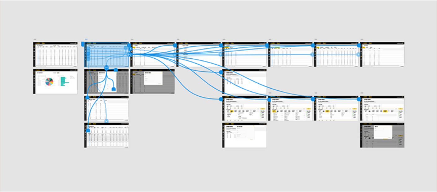
We had a very aggressive timeline and we needed a way to combine our requirements gathering phase with our initial information architecture layout. To make this happen we started laying out rough, wire-framed, click-through prototypes in Adobe XD. The easy sharing made our work effortlessly visible and elicited more and better feedback from the client. This created a smoothly undifferentiated iterative process.

As we achieved buy-in and understanding from stakeholders, we upgraded our wireframes in place and soon, our click-through prototypes were populated with fully navigable prototypes. This quick and easy feedback cycle was key to completing this project on time.
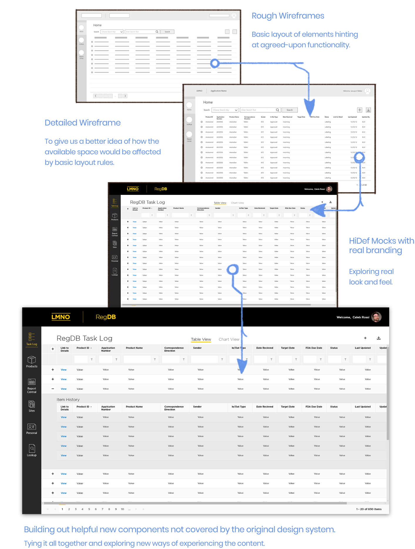
The design specs mode (even though it was in beta at the time of this writing and therefore a bit rough), made hand-off to the engineers more efficient than expected.
Key Changes
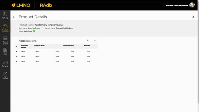
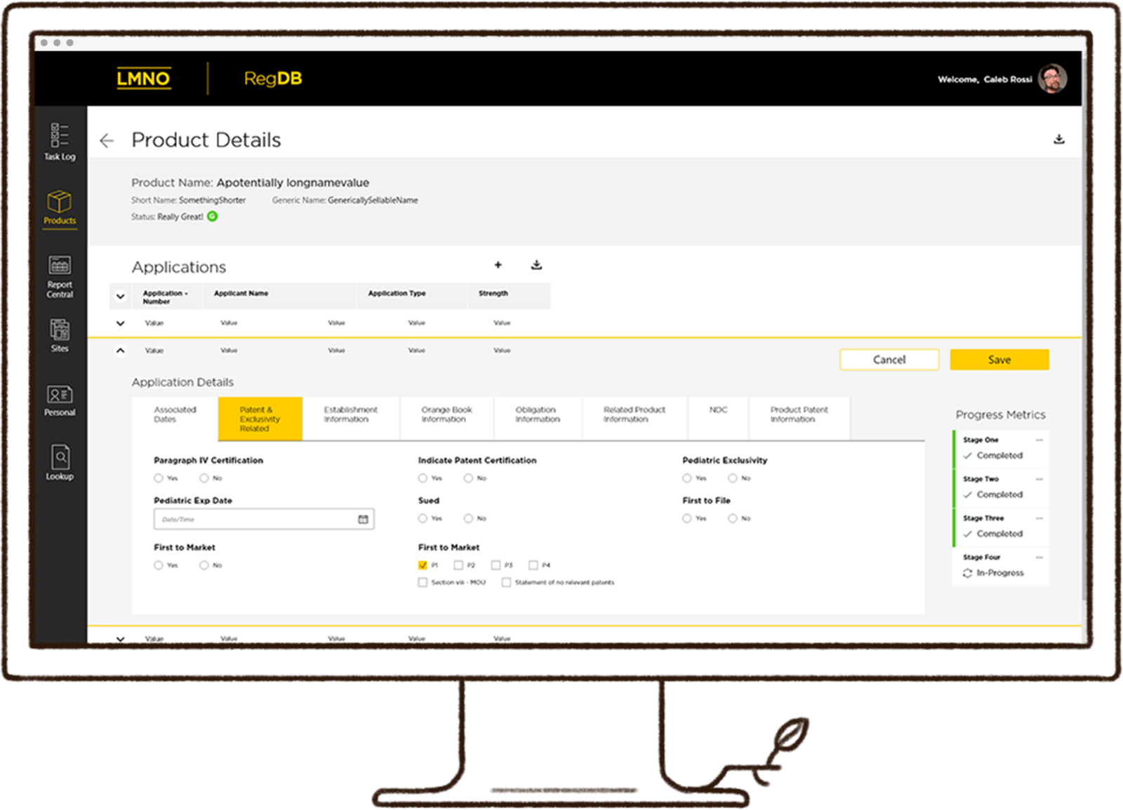
1. Software should fit the user's brain, not the other way around. We created an information architecture that fit the users' mental model and facilitated their various workflows. We wanted to make it easy for people to understand where they were in the application at all times.
2. Moving to a web based platform allowed for countless simultaneous users, thereby easing much of our users' frustration.

3. Direct interaction with data, combined with expandable table rows created tables that were bigger on the inside! Wherever appropriate, if data could be seen, it could be interacted with, in situ, allowing them to retain context as they worked on the data before them. This reduced the need for additional navigation and allowed for a fairly quick workflow. Hooking up keyboard shortcuts made this even more powerful.